Photography Composition for Beginners
My name is Jeremy and I am a photographer. I went to college at Seattle Central College. I had many photographer mentors who taught me along the way. I even modeled for a period of my education. You can look for these composition techniques used by top photographers across specialties such as new, fashion, architecture, landscape, and everywhere.
Suggestion #1
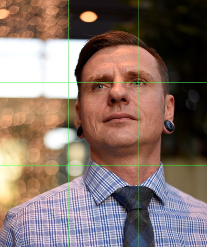
Rule of Thirds

Very common compositional technique that divides your frame into an equal, three-by-three grid with two horizontal lines and two vertical lines that intersect at four points.
Suggestion #2
Golden Ratio

This powerful composition principle has been used for centuries. It is a design principle based on the ratio of 1 to 1.618. Hailed as ‘the perfect number’, the Golden Ratio help strengthen your composition and attract viewers to your photographs.
Supposedly, sometime around the 12th century A.D. a mathematician named Leonardo Fibonacci devised a series of numbers that will produce an aesthetically pleasing composition. This composition is known as the Fibonacci Spiral.
The Fibonacci Spiral was created from a series of squares using Fibonacci’s numbers, with the length of each square being a Fibonacci number.
Suggestion #3
Framing

This is one of the key elements of photography that every artist can use. Framing in photography refers to the technique of drawing focus to the subject in the photo by blocking other parts of the image with something in the scene. Frames can be almost anywhere in the photograph. They can span over all four sides of the photo or encompass just one or two edges of the image.
The goal is to steal the viewer’s eyes by directing them to the main subject of the image. Frames can be made from a variety of objects and forms, and photographers often use light, arches, windows or even people to make a frame.
Suggestion #4
Sense of Depth

In this example the viewer’s eyes scans from near to far through the layers. This fading and converging of horizons creates a sense of depth, and natural framing as well.
Suggestion #5
Patterns and Symmetry

Fill your frame with a pattern or symmetrical subject. Create balance when you divide your photograph into two halves that hold the same weight and give a perfect or near perfect shape to your photograph.
Suggestion #6
Leading Lines

You can use lines (from roads, buildings, architecture, light, etc.) that direct the viewers’ attention to the main subject of the image. These lines leave an easy path for the viewer to follow providing interest in the overall image while keeping things clear and concise as far as composing the photograph.


